Posts

Business Cards

Image
      Yikes, so these didn't turn out great. I wasn't sure how to get the colored logos from the work I'd already submitted onto the document so I cropped them from the image on my blog and placed them in frames. They look a lot better as JPEGs on this blog than they did in InDesign which is a relief.                    Unfortunately on the last two you can see where I cropped it out of the image from a previous assignment. If it weren't for the lines on the image, I think it would be a good design. I did different shapes for each background to make them all unique. The fake number 42-42-564 comes from the show Soul Eater (it's the number they write on mirrors to call Lord Death) and the website is actually my Tumblr blog URL. You can follow me if you want, haha.
Learning to use InDesign

Image
      We're finished with Photoshop and moving onto InDesign.     InDesign is a program used for storing and organizing compositions. All images need to be in CMYK instead of RGB because the former is for print instead of computer screens. Images need to be in 300DPI so that they're not pixelated when in print. In this video he creates a folder with lots of files in it.     Unlike the other Adobe programs, this one has pages. Putting something on the master page will put it on every single page. You can add something called a gutter but I don't know what that is just yet. The guy in the tutorial is using something called a frame and you can put an image in it. You can limit text boxes into the frames as well/

Autoscopy Project

Image
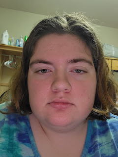
      For this project I had to take a photo of myself and edit it however I wanted to. Here is the photo I took specifically for this project.     I'm not making a very pleasant expression here, but it won't show up in the picture for reasons that will quickly become apparent. I downloaded lots of pictures that I could have used, but these are the ones I chose.     This is the final image, which took me 3ish hours to make.     There were a lot of different themes I was interested in doing, but I knew for sure that I wanted at least 3 sets of eyes. I ended up with 4 pairs by accident, but I didn't mind it enough to spend energy fixing it. I think if I wasn't doing this for a grade, I would've gone a lot more crazy with how much I did to the image. There's something appealing to me in a messy image, an image where there's so much going on that you can spend a while looking at it to make sure you're not missing anything.     I love the ocean a lot- marine

Somewhere Project

Image
      I Photoshopped myself into a screenshot from the show Criminal Minds. It's not my favorite show ever, but it is my favorite realistic show (my actual favorite is an anime which I felt didn't count for this project). Spencer Reid is my favorite character, so I made sure to find an image with him in the center.     I knew I needed one of them either in the plane or sitting around the table for a case debriefing instead of a scene of them chasing the suspect because I don't have a prop gun to use and there was no way I was going to edit one in. I couldn't find any screenshots with an empty space next to Spencer (the agent in the forefront, if you're not familiar with the show), so I took on the extra challenge of covering up Kate (the agent who's sitting next to him). I didn't feel the need to mess with the agents sitting in the back- Aaron to the left and Derek to the right- because having them included makes the scene feel more whole and realistic.    

Inspiration for the "Somewhere" project

Image
       I think this picture from Kirby Jenner's Instagram would be really hard to Photoshop myself into. The pose is very complex, and there's lots of stuff going on in the background. I don't think I would be capable of successfully matching the colors and lighting.     I chose this picture from Average Rob's Instagram because the background looks like it'd be a criminal's hideout in Criminal Minds, or maybe a place where the BAU would find a body. I'm going to edit myself into a scene where they take down an unidentified subject.     I like that he made the other two's pants into shorts that are even shorter than the ginger guy's shorts (which aren't even short in the first place).     I'm not gonna make something that looks like this, but I chose this image because the person is cosplaying Izaya, my favorite character from Durarara.

Black and White to Color Project

Image
      For this assignment, we had to take a picture of us and turn it from black and white into color. I chose this picture of myself because, in spite of the giant acne spot on my chin, it's a very good photo of me. Plus, I took it in my hometown, which I miss very badly right now. Each picture took roughly an hour and a half to make.     This is the first color palette I used, and it's my favorite.     The orange on my skin wasn't the best artistic choice I've ever made, but I didn't dislike it enough to change it. I think the red background provides a good contrast to me. I do wish I had made the buttons on my shirt stick out more; when I was making it, the buttons looked much more noticeable.      This is my second color palette. It's alright, not the best thing I've ever made.     Once again, the buttons bother me. The blue background gives a change in tone from the first one. I also decided to put a tiger over the acne spot on my chin. The tiger was ch

Logo Tag Brush

Image
    I made this art piece with the tag I made in Photoshop. The tag was created from the black and white logo I made in Illustrator for a previous assignment. I placed two of the tags together, but then I dragged the brush around for fun.     Here is the tag just by itself.     I put the scratch effect on the tag to make it look like it's sprayed onto a wall like graffiti. I used the negative effect to make it look like there was an eye on the long part of the paint splatter; I really like eye imagery so I thought it was cool that there were circles in the image the professor gave us. Despite all the visual noise around it, the viewer is till able to tell that it's a drawing of a fish. The only bad thing to say about this is that some of the streaking effect crosses right over the top fin, which makes the detail difficult to see. Other than that, it's completely obvious that this is a crying clown triggerfish. Well, it's obvious that's a fish, but only fish experts